
Climbing Roses Wedding Invitations | Secret Garden Collection
If you haven’t seen my review of the wax seals included in The Secret Garden, my exclusive collection with Artisaire, then you might want to either start at that blog post or you can watch the brief overview here:
In this blog post, I’m excited to dive into the first of 5 wedding invitation suites: Climbing Roses.
This full wedding invitation suite (including “day of” and “thank you” cards) is after my own heart. I’ve always wanted a stationery set featuring delicate line florals repeating in a beautiful toile pattern and echoed by elegant gold details.
In the end, this wedding invitation design has all of the old money wedding vibes that your heart could want. It really is an elegant collection of beautiful florals, graceful and unique typography and clean design that gives a formality to the overall stationery collection without losing the fresh quality. It is just stunning and I hope that you love this elegant rose inspired wedding invitation suite as much as I have enjoyed creating it for you!


Let’s look at the Climbing Roses invitation collection as a whole…
The main theme of this collection is found in the hand drawn roses. The toile inspired motif created by the hand illustrated roses is repeated throughout the collection in one way or another and unifies the classic wedding suite in a beautiful and elegant way. Shown here in the blue color way, this collection comes also comes in a neutral color palette as well as a pink/rose color palette and an elegant deep green. Envelope colors and printing adjusted accordingly


The invitation itself is elegant and simplified. A single sprig of roses ornaments the top of the invitation adds ornamentation to the playful and classic text arrangement. It gives the invitation a very stately and elegant look, which is contrasted by the full toile pattern on the back of the invitation itself (and most of the items in this suite). The inserts mimic the design, but elaborate on the theme. The detail card itself features the toile pattern and a unique oval design while repeating the rose illustration featured on the invitation. The same style of text is featured, showcasing elegant lines and playful typography, while still remaining formal and elegant. The elegant reply card features another floral illustration from the same toile print, but this time in a bold and modern way—across the entire card. This contrast brings this otherwise formal invitation suite a bold twist that sets it apart from the rest.
Fun fact: the rose illustration on the invitation and detail card are the perfect size to cover with a wax seal, should the couple decide to accentuate their unique style in that way.
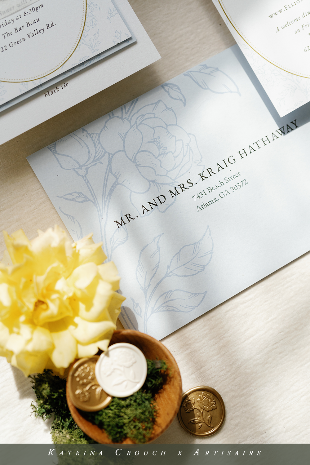

The unique design elements are repeated on the envelopes themselves in the most beautiful way! These unique envelopes feature the same full illustrations as on the response card and a full toile pattern on the smaller reply and thank you envelopes. They’re show stoppers right from the very beginning and I know that you’ll love using them for your wedding invitations and beyond! I know I’ve already used them!
And the unique save the date might be my favorite one of the entire Secret Garden collection. The unique horizontal layout and the frame of flowers around it just do something to me. The full toile pattern on the back solidify my love for this elegant save the date design and the gold text is the icing on the cake.


I love how the “Old Money” aesthetic carries through the menus, elegant wedding programs and even the table numbers and escort cards! A mixture of beautiful toile print, floral frames and graceful gold accents repeats the same elements with a graceful elegance that creates the most classic and beautiful wedding theme with a modern, graceful twist.
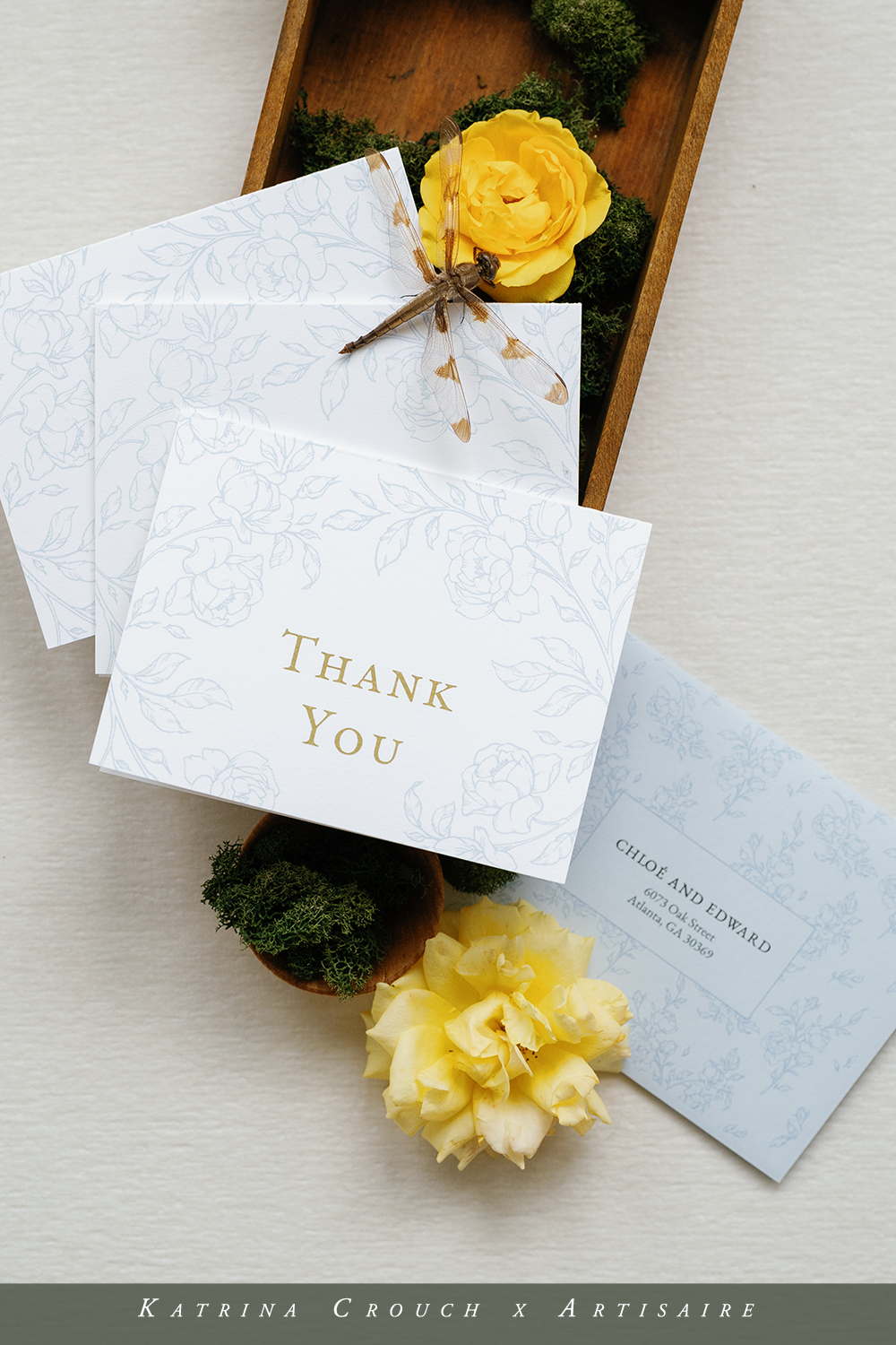

I love these “thank you” cards and definitely plan to use them in my personal life! I think they’re so elegant and pretty without being overwhelming. I’m just going to be torn as to which of the four color ways I should choose! And can we talk about the toile envelopes again? They’re just so beautiful!
As you’ve probably guessed, this suite was designed to pair perfectly with the Garden Rose wax seal (did you know that there is a personalized option as well? She’s a beaut!) and coordinates well with the Botanical Initial and Secret Lock wax seal designs. Of course I love the gold wax, but also enjoyed using the buttercream and dusty blue wax colors as well with this blue color palette. I obviously went for a more monochrome aesthetic—but wax seals are such a great way to go bold! Someday I’ll definitely branch out and explore that more with this suite.


