
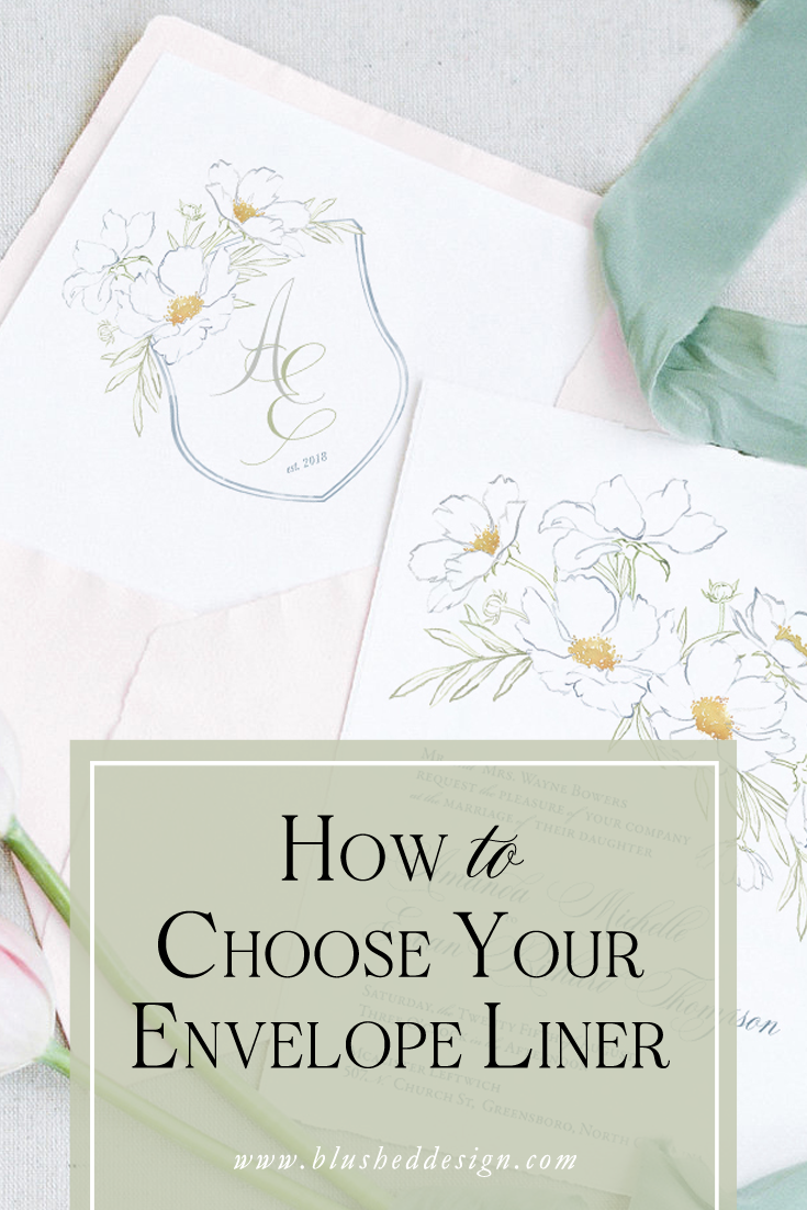
How to Choose Your Envelope Liner
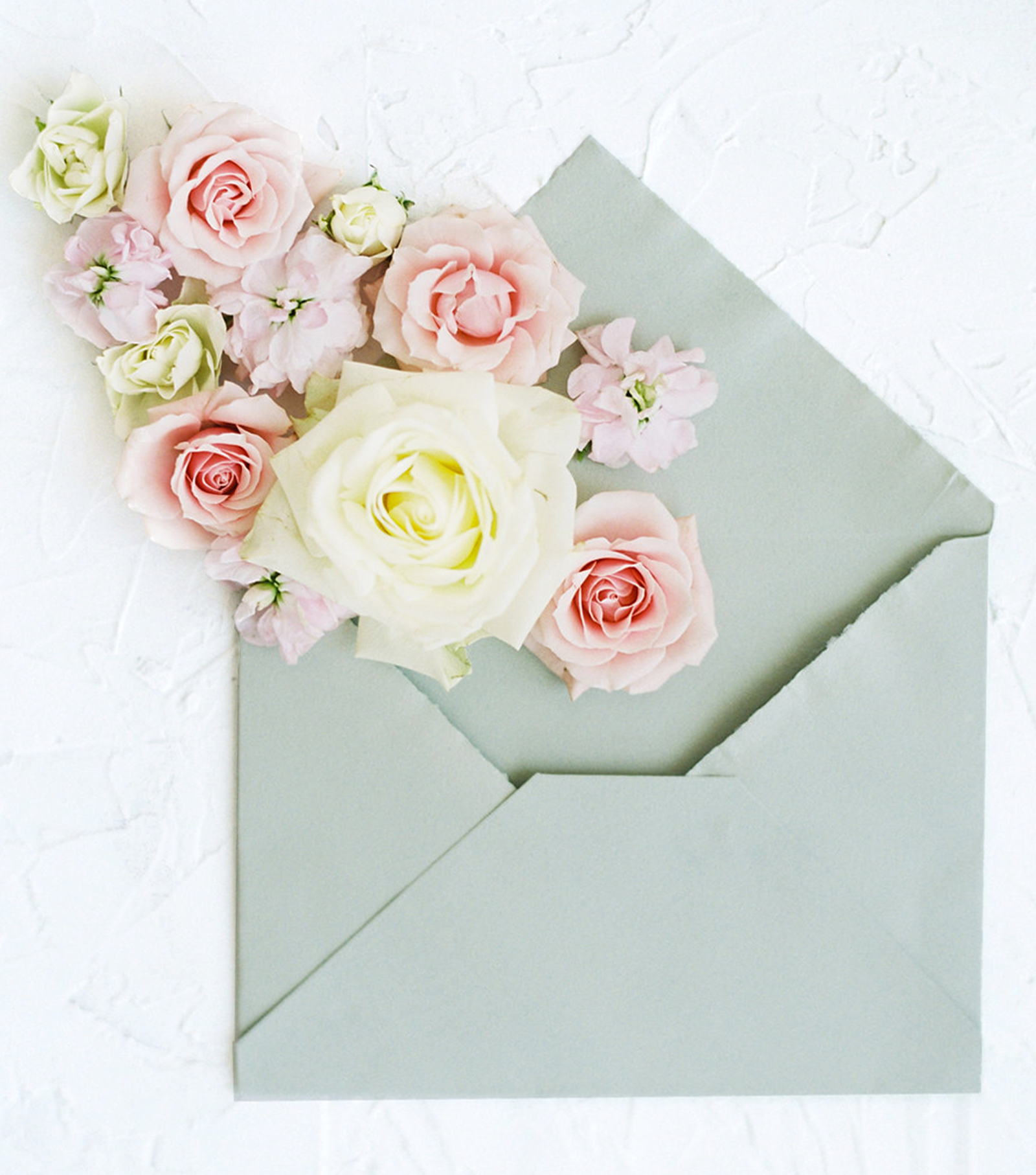
Envelope liners are the perfect way to add that "wow" factor to your wedding invitations. From a custom monogram, to a beautiful floral pattern, to a venue illustration, your envelope liner design is only limited to your imagination.
History of Envelope Liners:
Historically, envelope liners were used to protect the contents from the envelope itself and the elements as it was being delivered. As a bonus, liners also provided a little extra privacy (more important when each letter is hand delivered and sorted by people who know you personally!).
As most things go, form followed function and soon envelope liners were more than just a simple scrap of paper, cut to fit the envelope—they became wonderful excuses to add beauty and express your personal style in a space that is otherwise wasted. As you might guess, envelope liners currently serve the latter purpose, though if you decide to use a vellum (transparent) envelope, a liner is a good way to protect your privacy.
I hope that you are already convinced that adding an envelope liner to your wedding invitations (or even your snail mail) is an aesthetic “must”! But how do you choose what style of liner to use?
When To Go Bold:
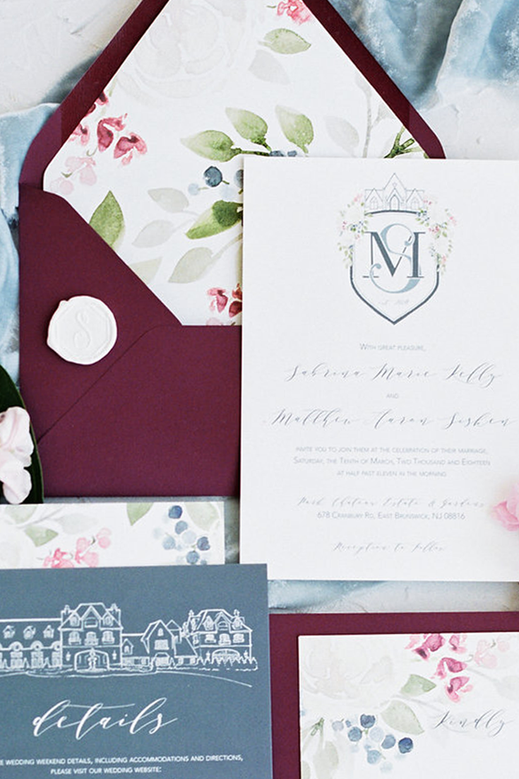
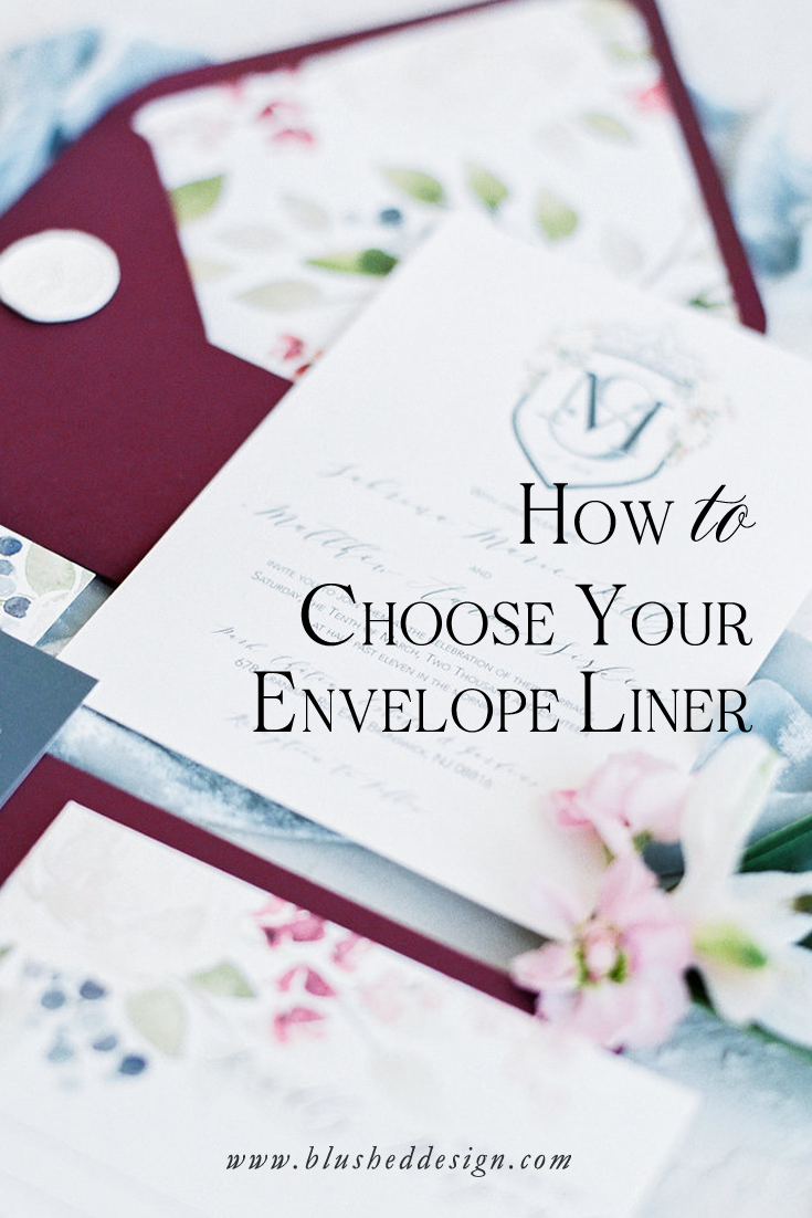
First, let’s look at your invitation suite. If your design is simple and elegant, then this is an excellent opportunity to go bold! Like the example I have above—the face of the invitation is rather simple: the crest and calligraphy are given an opportunity to shine with a simple layout and classic presentation. To give the suite an extra punch, we enlarged the flowers from the crest and created a motif to be used for the back of the invitation and on the envelope liner itself.
To keep the entire suite from growing too busy with that elaborate liner, the details card and even the response card were kept simple.

When To Be Subtle:
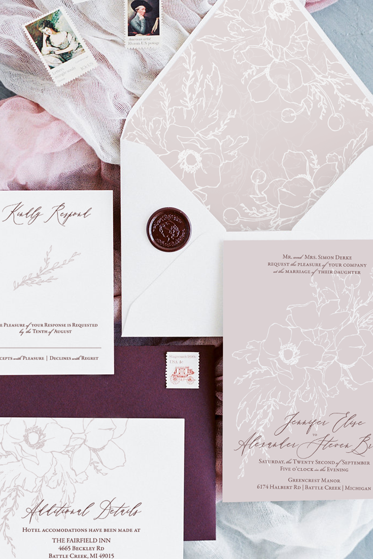
A bold liner is not for everyone, and it does not compliment every suite. In the example above, you will find two examples of invitation suites with a more subdued liner. In the example on the left, the invitation has some statement artwork featured and a more modern text layout with the abrupt left flush. I wanted to repeat the floral element, but it would have been too distracting to include the design as a pattern—it would have been difficult to visualize where the invitation ended and the liner began. A simple crest using the same florals on a smaller scale was the perfect solution for this space. Keeping it centered and otherwise free of clutter helped to mimic the design without stealing the show.
In the example to the right, you will find another modern text layout with the invitations and another statement floral. This design really plays off the large negative spaces that are used throughout the suite, so I wanted to create a piece that “filled in” some of that space. However, a bold liner would not have worked in this case because the rest of the suite was so consistent. Therefore, I created a continuous pattern in the same colors and with the same artwork. This helped to create a balance between the empty space and the filled space, without overpowering the suite as a whole.
Still Unsure?
It’s all about balance. Either symmetrical balance, or asymmetrical balance. Either you design the entire suite to match and be a cohesive unit, or you go bold in one area and tone the volume down in another area. Another way to think of asymmetrical balance is through fashion. I wouldn’t recommend wearing an all over pattern in every element of your outfit (thought that style certainly has it’s place)—but a pop or color, or a bold pattern in a scarf or blouse or even a skirt can create a real statement when paired with more neutral items. For an example of symmetrical balance in fashion, think of an outfit with a consistent color palette or small detail. A little more matchy-matchy, but that doesn’t mean it is not a chic show stopper!
If you’re hesitant, I recommend handing this element over to your stationer. With their trained eye and experience, they are sure to be able to help you make the right choice!
Pin one of these for later:

Love what you see? Let’s chat about your own wedding invitations!
I can’t wait to hear about your big day
Photos and Styling on this page by: Shanell Photography and Katrina Crouch